
Today, I’m Going to give you 40+ Tips to optimize your website’s core web vitals.
Yes, You’ve Landed on the most detailed and advanced core web vitals checklist present in 2023.
These are the most easy and highly actionable tips you’ve ever found.
So let’s start
- Loading Performance Checklist (LCP)
- Interactivity Performance Checklist. (FID)
- Visual Stability Improvements Checklist (CLS)
- Mobile Performance Checklist
- General Improvement Checklist
- Bonus – Explain the step Use event delegation for FID.
- Conclusion
Even If you have zero knowledge or you’re a beginner, you can easily execute these tips into action.
After Following these easy tips, your website speed almost looks the same as in the given pic below.

Why are Google Core Web Vitals important?
As we know, Core Web Vitals are the most critical ranking signals and set of
metrics introduced by Google that measure the user experience of a website
in terms of loading speed.

Now one more thing,
How to Check a website’s loading speed score?
To check the score, I recommend Google page speed insight and Gtmetrix.
Just put your website URL inside these tools and get your reports in seconds.

Now Let’s move on to our checklist.
I have designed these tips, to give you the exact results,
Just try to follow the best you can.
It will give massive growth to the loading speed.
Loading Performance Checklist (LCP)
Firstly we will fix one of the key components of Core Web Vitals, which
measures how quickly a web page loads and becomes usable for the user.
Loading performance is evaluated using a metric called Largest Contentful
Paint (LCP), which measures the time it takes for the largest element on the
page (such as an image or a block of text) to become visible to the user.
1. Optimize images for web use
To optimize images for web use, there are a few things you need to check
before uploading to your website.
Resize your images to the dimensions needed on the website.

This reduces the amount of data that needs to be loaded and helps to speed up the website.
The second thing is to Compressing your images can reduce their size without Content Affecting the quality of the picture.
You can use the tool Tinypng to lower the size of the image.
2. Use a Content Delivery Network (CDN)
I always recommend using a Content Delivery Network (CDN) as a step that can help improve the LCP faster.
The reason Why?

When a website uses a CDN, the user’s browser can retrieve images,
videos, and scripts from the closest server in the network.
This reduces the distance that data must travel, which results in faster
loading time.
To use a CDN, you can choose from a variety of third-party CDN providers
or set up your own CDN using tools like Amazon CloudFront or Cloudflare.
3. Use a caching plugin
A caching plugin is a software tool that can be installed on a website to
help manage caching and improve loading times.
These plugins work by creating and storing a cached version of a web
page or resource, which can then be served to users when they visit the
site.
By using a caching plugin, You can reduce the amount of time your
website content is taking to load, which can help improve the LCP metric
and overall Core Web Vitals scores.
I recommend using plugins such as WP Super Cache and W3 Total Cache
for WordPress sites.
Or,
You can choose a caching plugin that is compatible with your platform
and follow the plugin’s installation and configuration instructions to ensure
optimal performance.
4. Reduce the number of HTTP requests
By just reducing the number of HTTP requests made by a website is One of
the steps to improve loading performance and reduce LCP.
HTTP requests refer to the number of times a browser needs to request
resources from a web server to fully load a web page, such as images, scripts,
stylesheets, and other assets.
The more HTTP requests a website makes, the longer it will take for the
website to fully load.
There are some ways to reduce the number of HTTP requests.
-
- Combine files: Combining multiple CSS or JavaScript files into a single file can reduce the number of requests made by the browser.

-
- Use CSS sprites: CSS sprites involve combining multiple images into a single image, which can reduce the number of image requests made by the browser.
-
- Minify code: Minifying code by removing unnecessary spaces and characters can reduce the size of files and speed up their download time.
-
- Leverage browser caching: Caching involves storing commonly used resources on the user’s device, which can reduce the number of requests made to the server.
By reducing the number of HTTP requests, you can improve LCP times and
provide a faster and more efficient user experience for their visitors.
5. Use lazy loading for images
Lazy loading helps images to load only when they are needed in the viewport of the user’s browser.
This means that images that are not currently visible to the user, such as
images at the bottom of the page, are not loaded until the user scrolls down
and the images come into view.
By using lazy loading, You can reduce the number of resources that need to be loaded upfront.

Which can help improve LCP times and overall page load speed.
You can implement lazy loading for images, by using various techniques,
including JavaScript libraries and built-in HTML attributes such as the
loading=”lazy” attribute.
For WordPress users, you can use – Lazy Load plugin
6. Minimize and compress CSS and JS files
One step to reduce LCP time is to minimize the CSS and JS files.
Because these files are critical components of web pages, as they help define
the layout, styling, and functionality of the website.
So, these files can also be large and slow to load, which can significantly
impact the LCP time.
Key points to Minimize the CSS and JS files:
1. Remove any unused code.
2. Combine CSS and JS files.
Overall Minimizing the CSS and JS files is an important step to optimize the LCP time.
7. Reduce server response time
Reducing the server response time is a beneficial step in improving the LCP metric.
Server response time refers to the time it takes for the server to respond to a
user’s request for a web page.

When a user requests a web page, the server must process the request and return the requested content.
The longer it takes for the server to respond, the longer it takes for the web page to start loading.
And seriously that’s a problem.
To improve LCP times you need to reduce server response time.
Pro tip: Make sure the server is configured properly and can handle the expected traffic volume.
8. Minimize the number of external scripts
Another step to optimize the performance is to minimize the number of external scripts.
External scripts are JavaScript files that are hosted on another server and are loaded onto a web page when it is accessed by a user.
These scripts can include third-party integrations such as analytics tracking, social media widgets, and advertising scripts, among others.
When many multiple external scripts will load it causes a delay in the page load time.
To minimize it, You can take the following steps:
1. Remove unnecessary scripts
2. Combine scripts
3. Load scripts asynchronously
9. Use a fast and reliable hosting service
Why do you need to use a fast and reliable hosting service?

The answer is, When a user requests a web page, the server hosting the website must respond quickly to deliver the necessary files and resources required to display the content.
If the server is slow or unreliable, it can cause delays in loading the webpage, which can negatively impact the LCP metric.
You can read this guide to choose the best hosting services.
10. Reduce the file size of web pages
Large file sizes can significantly slow down page loading times.
And Guess What?
It will increase LCP times and result in a poor user experience.
And the solution to this problem is, You can compress the images present on the website.
Check the file size of web pages first,
Just put your URL in the tool.


And finally, you have the total size of the page with other metrics.
Try to minimize the unused code and remove unnecessary content such as large images and animation from the page.
Pro tip: Use compression techniques such as Gzip, which can be used to compress files before they are sent to the user’s browser.
Interactivity Performance Checklist (FID)
So, mainly Interactivity Performance is measured by the First Input Delay (FID), which is the time it takes for the page to respond to the first user interaction.
And in this checklist, I’ll show you, How easily you can optimize FID and become google’s top favorite.
11. Reduce JavaScript execution time
It’s Simple If Java Script is taking more time to execute on your website, It will directly impact FID.

You can easily reduce the execution time by minimizing the amount of JavaScript you use.
Try to only use the necessary JavaScript, and remove any unnecessary code or libraries.
And
You can use code splitting, a technique that involves splitting your JavaScript code into smaller chunks so that only the code that’s needed for a particular page is loaded.
Done!
12. Reduce the number of layout shifts
While loading your web page if the content moves around unexpectedly, this will occur in Layout shifts.
I mean, think of it, this can be very frustrating for the users.
So, how can you reduce the number of layout shifts and improve the FID?
Here are a few tips:
- Set the size of images and videos the same as specified in the HTML or CSS.
- If your website includes ads, make sure to reserve space for them in advance.
- By loading the web font asynchronously, you can ensure that the text stays in place while the fonts load.
I’ll talk more about this in Visual Stability Improvements Checklist (CLS)
13. Use requestIdleCallback for non-critical tasks
So simply, requestIdleCallback is a browser API that allows developers to schedule non-critical tasks to run when the browser is idle.
See, this means that tasks that aren’t important to the loading of the page, like analytics, tracking, or animations, you can stop them until the browser has finished rendering the page.
Here’s an example of how to use requestIdleCallback:

Your developer can help you to set this code.
14. Avoid long tasks on the main thread
When handling users’ interactions with the website, the main thread is a boss.
The problem is if long tasks are running on the main thread,
it can delay the user’s interaction with the website and increase the FID.
Long tasks are any tasks that take longer than 50 milliseconds to complete.
Now the Question is How To Avoid long tasks on the main thread?
-
- You can Try to reduce the amount of JavaScript on your website.
-
- Using Web workers is a way to run JavaScript in the background, separate from the main thread.
15. Remove unused JavaScript
Okay, When a web page loads, it needs to download all of the JavaScript files that are included on the page.
Just think, If there is unused JavaScript code that is not necessary for the page, it can slow down the loading time and increase the FID.
To remove unused JavaScript, you can start by finding the JavaScript code.
I always use Google’s PageSpeed Insights and Lighthouse, Just Pop up your Page’s Url in the tools.
And these tools can help you to identify the unused JavaScript code.
These tools can also suggest ways to optimize your code to reduce its size and improve its performance.
You have successfully identified the unused code.
Now It’s time to remove it.
This can be done manually by editing your website’s code, or by using a tool such as a JavaScript minifier.
Which can automatically remove unnecessary code and optimize the remaining code.
And That’s it.
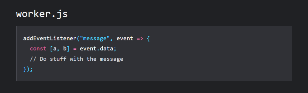
16. Use a worker thread for CPU-intensive tasks
When a user interacts with your website, such as clicking a button or filling out a form.
The browser needs to respond quickly to that input to provide a good UX.
But, if the browser is busy with CPU-intensive tasks, such as JavaScript computations or other processing tasks.
it may not be able to respond on time.
Which leads to a long FID.
To avoid this problem,
You can use a worker thread to reduce CPU-intensive tasks from the main thread of your website.

A worker thread is a separate thread that can run independently.
It can easily handle heavy computations without interfering with the responsiveness of the main thread.
Which is Awesome.
Pro Tip: However, it’s important to note that not all browsers support worker threads, so you should check browser compatibility before implementing this technique.
17. Prioritize content loading
To improve your FID, Make sure to prioritize the loading of the content that’s necessary for the user to interact with your website as quickly as possible.
This means you just need to identify the “ Critical Path” for loading your website.
The critical path is the sequence of resources that are necessary for rendering above-the-fold content.
Now, What is above-the-fold content?

Above-the-fold content is the content that’s visible to the user without scrolling down the page.
After prioritizing the critical path, just make sure that the user can interact with your website as quickly as possible.
Here are a few tips for prioritizing content loading:
-
- Use tools like Google’s PageSpeed Insights or Lighthouse to identify the critical resources that are necessary for rendering above-the-fold content.
- Once you’ve identified your critical resources, optimize them to reduce their file size and load time. This can include compressing images, minifying CSS and JavaScript, and using browser caching.
- Load critical resources as early as possible in the page-loading process. This can include using techniques like inline CSS and JavaScript, preloading critical resources, and using asynchronous loading.
18. Use a preloader for images and videos
If your website contains large images or videos the browser must download these resources before they can be displayed on the page.
It will create a problem for the user to interact with the page and result in poor UX.
Yes, only a preloader can help solve this issue.
It will display a loading animation or placeholder image while the larger image or video is being downloaded.
There are different types of preloaders you can use.

It depends on the type of resource you want to preload.
For images, you can use a low-resolution image as a placeholder.
Or you can use a CSS spinner animation.
For videos, you can use a loading animation that displays while the video is buffering.
Pro Tip: Just be sure to balance the use of preloaders with the overall performance of your website, as too many preloaders or overly complex preloaders can also negatively impact the user experience.
Visual Stability Improvements Checklist (CLS)
Now, It’s time to optimize the visual part of the page to improve the UX score for best rankings.
Visual Stability Improvements include the Optimization of Cumulative Layout Shift (CLS).
And
Cumulative Layout Shift (CLS) is a metric that is used to measure the visual stability of a web page.
I’ll show you a list of all factors which help magically in optimizing your page for (CLS)
So Let’s start….
19. Use aspect ratios for images and videos
So When images or videos are added to a web page without a defined aspect ratio, they may cause layout shifts as the page loads.

I mean, the browser has to wait for the media to load before it can determine the correct size and position of the element.
And It will Frustrate the user.
To set an aspect ratio for images and videos.
You can use CSS styles.
For example, the following code sets a 16:9 aspect ratio for a video element

By following this step you can easily optimize your web page for CLS and improve the user experience.
20. Reserve space for ads
So it’s a very basic problem but also is an important step in optimizing for Cumulative Layout Shift (CLS).
When ads are loaded on a webpage.
They can cause unexpected layout shifts if their dimensions are not specified in advance.
This can usually occur when the ad is being loaded.
It’s harmful to the overall user experience on the page.
And the solution is,
Always make sure to reserve space for ads in advance.

This means specifying the dimensions of the ad space in the HTML and CSS code.
So that the browser can reserve the appropriate space for the ad.
21. Use animations with care
We all know using animations on a website can add visual interest and improve the overall user experience.
But careful,
Animations sometimes also contribute to layout shifts and negatively impact the Cumulative Layout Shift (CLS) metric.

Have you ever heard about this before?
Worry not, I’ll give you some tips to use animation with care.
-
- Always avoid using animations for purely decorative purposes.
- Keep animations short, longer animations increase the likelihood of layout shift.
- Using animation triggers can help ensure that animations occur at the right time.
- Use preloading: Preloading ensures that animation loads quickly and smoothly.
And that’s it you’re done.
22. Load web fonts asynchronously
In the Interactivity Performance checklist,
I used this point as a tip, but now I’ll try to explain more in detail here.
See, When a web page uses custom fonts.

Maybe that causes layout shifts.
Why?
Because the text on the page may appear to “jump” as the fonts load.
And the solution is,
You just need to add an “async” or “defer” attribute to the font-loading script in your HTML.

And
This will help the fonts to load in the background.
While the rest of the page is loading, without causing any delays or layout shifts.
23. Optimize font loading
Fonts can take time to load when it’s not properly optimized.
And this can cause layout shifts on a web page.

To avoid this.
You can use the following steps to optimize font loading.
Use web-safe fonts:
Web-safe fonts are those that are commonly available on most devices and browsers.
They load quickly and won’t cause layout shifts.
Preload fonts:
Preloading fonts means that the font files are loaded in the background before they are needed on the page.
This can reduce the time it takes for fonts to load and prevent layout shifts.
Use font-display:
Font-display is a CSS property that determines how fonts are displayed while they are loading.
By using this property,
You can specify how long it takes for the font to load and how it is displayed during that time.
Hope these tips can help you a lot.
24. Use a fallback font for slow connections
One of the reasons for this unexpected layout shift is the delay in loading custom fonts on a Web page.
Let’s take an example
You have used a custom font on your web page.
In that case, the browser will wait for that font to load before rendering the text.
This delay can cause layout shifts, especially on slower internet connections.
To avoid this issue,
I recommend using a fallback font for slow connections.

By using a fallback font, the browser can render the text immediately.
Even without waiting for the custom font to load.
See if you make things easy for the browser, the browser will help you to rank on top.
25. Avoid inserting new content above existing content
So this unexpected layout shift happens on a webpage.
By the insertion of new content above existing content.
This can mainly happen when dynamic content, such as ads or images, loads after the initial content has already been rendered on the page.

And
When this happens, the existing content is pushed down, causing a layout shift.
To tackle this issue,
You need to reserve space for dynamic content and avoid inserting new content above existing content.
And
This can be done by setting the dimensions of the dynamic content in the HTML or CSS of the web page.
It will also help the browser know exactly how much space to allocate for that content, and it won’t need to push down existing content to make room for it.
That way, You can optimize CLS for the best rankings in SERPs.
Mobile Performance Checklist
According to the latest data from GSMA Intelligence.
There are 5.44 billion active mobile users there.
That’s the reason you need to optimize your core web vitals performance for mobile users also.
I’ll show you How you can accomplish this.
26. Use responsive design
When a website automatically adapts its layout and content to different screen sizes and devices.
Such as smartphones, tablets, and desktops.
That’s a Responsive design.

Why? I’m saying to use responsive design.
Mobile users, in particular, tend to have a lower tolerance for slow-loading sites.
You have to make sure your website is optimized for all screen sizes.
And
As always I’ll give you some tips on this.
1. Always design your website with the mobile user in mind first, and then scale up to larger screens.
This can help ensure that your site is optimized for mobile performance.
2. You Need to minimize the number of page elements.
Such as images and scripts, to reduce the load time and improve the user experience.
3. Use images that are optimized for the web and compressed to reduce the file size.
27. Minimize viewport meta tags
The visible area of a web page displayed to the user on their device’s screen is called the Viewport.
About viewport meta tags.
It is a piece of HTML code that defines the size and scaling of the viewport on mobile devices.
If you will use incorrect viewport meta tags, it will be a common cause for layout shift.
To minimize the impact of viewport meta tags on mobile performance.
I recommend using the “width=device-width” value.
Which helps to set the width of the viewport to be the same as the device’s width.
Note: Also Google recommends this value for the viewport meta tag.
28. Use AMP (Accelerated Mobile Pages)
With increasing the number of users accessing websites on their mobile devices.
You must need to optimize the websites for mobile.
This is when AMP comes into the game.
It’s an open-source framework developed by Google that allows us to create web pages that load quickly on mobile devices.
It’s specially designed to be lightweight and streamlined, with a focus on delivering a fast and seamless user experience.
Here are the steps to use AMP to improve mobile performance:
1. To use AMP:
You’ll need to implement the AMP framework on your website.
This involves adding a specific set of HTML tags to your web pages
Which directly signals to search engines that the pages are AMP-compatible.
2. Create AMP versions of your pages:

Once you’ve implemented the AMP framework.
You’ll need to create AMP versions of your web pages.
Now, these pages will have a different URL and will be optimized for mobile devices.
3. Monitor your mobile performance metrics:
After implementing AMP, it’s important to monitor your mobile performance metrics to see if there are any improvements.
This can be done using tools like Google’s PageSpeed Insights, which provides insights into your Core Web Vitals metrics.
4. Optimize your AMP pages:
Once you’ve identified areas for improvement, you can optimize your AMP pages to further improve your mobile performance metrics.
This may involve reducing the size of images or removing unnecessary scripts and plugins.
And that’s it.
29. Use adaptive images
Mobile devices come in different screen sizes and resolutions.
This means that you need to ensure that images are optimized for different devices to improve overall mobile performance metrics.
You can easily solve this by using adaptive images.
Adaptive images are images that are automatically adjustable in size and resolution based on the device that is accessing the website.

The magic is users on smaller devices, such as mobile phones, will be served smaller images that load faster.
And
The users on larger devices, such as desktops, will be served larger images that are more suitable for their screen size.
30. Compress and optimize mobile images
As we know, images are an important part of web design.
But remember they can also be a major contributor to slow page loading on Mobile devices.
If you want to meet the mobile performance requirements of the Core Web Vitals.
It’s really important to compress and optimize your mobile images.

Here are the steps to follow:
1. There are several different image formats to choose from, including JPEG, PNG, and WebP.
Each format has its strengths and weaknesses. But for better results, I prefer to use PNG or Webp formats.
2. Before uploading your images to your website, Always resize them to the appropriate dimensions.
3. Once you’ve resized your images, now you can further reduce their file size by compressing them.
There are several different tools and plugins available for image compression, including Adobe Photoshop and online compression tools like TinyPNG.
31. Use server-side rendering for mobile
Before being sent to the users.
There is a technique that allows web pages to be rendered on the server.
That’s simply called Server-side rendering (SSR).

By using SSR, you can improve your mobile performance metrics.
I’ll tell you how?
1. To use SSR, you’ll need to implement it on your web server.
This involves a process of setting up a server.
That can render web pages on the server side and send them to the user as fully rendered HTML.
2. After the SSR implementation process, you just need to select pages to render server-side.
You need to give priority to pages that are critical to your website’s user experience and have high traffic.
3. Once you’ve selected which pages are required to render server-side.
Now it’s time to configure your server to render those pages in this way.
This involves making changes to your server configuration and using a server-side rendering framework.
4. Now you’ve identified areas for improvement.
And you can optimize your server-side rendered pages by following the process of reducing the size of images or removing unnecessary scripts and plugins.
Overall, you can provide a fast and seamless mobile experience for your users.
32. Use lightweight CSS frameworks
Sometimes developers use CSS frameworks that are pre-designed CSS code to speed up the development process.
But the real problem is that,
These frameworks are very heavy and slow down the loading time of your website.
The only solution is, you need to use lightweight CSS frameworks
Or,
You need to reduce the overall weight of the CSS code on your website.
Both options came with the same results.
I’ll guide you on how you can do this.
1. When selecting a CSS framework, always choose a lightweight and optimized framework for performance.
Some examples of lightweight CSS frameworks are Fictoan, Pure, and Milligram.

2. Once you’ve selected a lightweight CSS framework. You can customize it according to you.
Just remove all unnecessary CSS code and include only the code which is very essential to your website’s design.
3. After customizing the framework, Follow the process of minimizing your CSS files.
Pro tip – By continuously optimizing your CSS code, you can provide a fast and seamless mobile experience to your users.
General Improvement Checklist
Everyone loves sweet desserts after a delicious dinner.
Here are some additional factors, which your competitors may not know!
And that’s a big difference !!
I’ll show you how you can use these additional factors to win the race while staying in your lane only.
Let’s start
33. Use a performance budget
A performance budget is a set of rules that dictate the maximum amount of resources, which your website is allowed to consume. Such as page weight, load time, number of requests, and more.
Its main purpose is to keep a website’s performance in check and to ensure that it stays within acceptable levels for users.
With the help of this, you can also identify which resources are taking up too much space or causing delays in page load time.
I mean, this is awesome.
To create a performance budget for web pages.

You’ll need to first identify the key performance metrics that you want to optimize.
For Core Web Vitals, these metrics should be
-
- The time it takes for the largest element on the page to render (LCP).
-
- The time it takes for the page to respond to user input (FID).
-
- The number of unexpected layout shifts that occur during the page load (CLS).
Great, now You have your performance metrics.
Now you can set specific targets for each one.
For example, you might set a target of
-
- 2 seconds for LCP
-
- 100ms for FID
-
- 0.1 for CLS
And the good part is, you have a complete checklist of core web vitals right in front of you.
I had already given you the exact steps to optimize these factors.
So, go ahead.
34. Keep your website up-to-date
There are several reasons to regularly update your website, which includes security, functionality, and design.

But in Core Web Vitals’ case, updating your website can also help to improve its performance and ensure that it meets Google guidelines.
Which is highly important.
I’ll tell you some points to keep your website up-to-date for better Web Vitals performance:
1. No Matter if you write content for your personal blog or maybe as content marketing services don’t forget to update your content management system (CMS) and plugins.
2. Make sure that your images are properly optimized for the web, with an appropriate file size and format.
3. Make sure that your code is as lean and efficient as possible, and remove any code that is no longer necessary.
4. Use a content delivery network (CDN), You can read the importance of using a CDN
35. Use HTTP/2
HTTP/2 is a newer version of the HTTP protocol.
Which is designed to improve the speed and performance of websites.
Its main benefit is it allows multiple requests and responses to be sent simultaneously over a single connection.
Pretty Insane,
This helps the websites to load more quickly and efficiently.

To use HTTP/2, you’ll need to make sure that your website is hosted on a server that supports this protocol.
You’ll also need to make sure that your website is configured to use it.
Additionally, HTTP/2 can also help reduce the number of resources needed to load a page.
Which can also have a positive impact on metrics like Cumulative Layout Shift (CLS).
36. Monitor website performance
Monitoring your website’s performance is an important step.
When it’s come to optimizing Core Web Vitals.

I’ll tell you some steps you can take to monitor your website’s performance:
1. Use a website performance monitoring tool, such as Google’s PageSpeed Insights or Lighthouse, to measure your website.
These tools will provide you with a detailed analysis of your website’s performance, including its Core Web Vitals scores.
2. Now you have performance analysis and use the information provided by the monitoring tool to identify areas of your website that need improvement.
3. Try to Prioritize the improvements that will have the most significant impact on your website’s Core Web Vitals scores.
I suggest making a list on Notepad.
4. Now, Implement the changes you’ve identified and monitor the results.
You can use the website performance monitoring tools to measure the impact of your changes.
5. The key is to continue to monitor your website’s performance regularly.
Make changes as needed to ensure that your website’s Core Web Vitals scores remain optimized.
37. Reduce the number of redirects
Redirects slow down the loading time of your pages.
With affecting user experience and ultimately, your search engine rankings too.
Having too many redirects on your website can be toxic sometimes.

I’ll provide you with some steps to reduce redirects.
1. Identify the redirects on your website.
2. Check if the redirects are necessary or if not necessary, remove them.
3. Fix all broken links because broken links can result in unnecessary redirects.
4. Replace 301 redirects with 302 redirects.
5. Use internal links instead of redirects.
6. If you have multiple versions of the same page use a canonical tag.
38. Use a cookie-free domain for static assets
What is a cookie-free domain?
Well, the answer is in the name itself.
A cookie-free domain is a domain that does not use cookies.

And
Cookies are small pieces of data that websites store on a user’s device to remember their preferences or track their behavior.
When a user visits a website, their browser sends a request to the website’s server for any cookies associated with that website.
If the website has a lot of cookies, it can significantly slow down the load time for the user.
When you will use a cookie-free domain for static assets.
Like – for images, CSS, and JavaScript files.
You can reduce the number of requests made to your main domain.
And
It can help improve your website’s load time and Core Web Vitals scores.
39. Use browser caching
I’ve already touched on this concept a few times in the checklist above.
But I’ll explain in detail now.
So, Browser caching is the temporary process of storing a copy of your website’s files on the user’s device.
Why?
Because when a user revisits your website,
Their browser quickly retrieves the cached files instead of downloading them again from the server.
And this can reduce the time load for your website.
To implement browser caching, add cache headers to your website’s files.
These headers tell the user’s browser how long to store the cached files before requesting new versions from the server.
You can also set the Cache-Control header to instruct the browser to store the cached files for a specified time.

By reducing load times and the number of requests made to the server.
You can provide a better user experience for your visitors.
40. Use defer and async attributes for the script
Certainly! Optimizing the performance of scripts is a crucial step in improving the Core Web Vitals of your website.
I’ll show you how?
When a script is included in your webpage. It can block other resources from loading until it has finished executing itself.
And see that’s the reason for slow loading times.
To solve this issue, you can use the “defer” and “async” attributes.
These attributes help you to control how scripts are loaded and executed.
41. Use lazy loading for iframes
I’ve already explained the step of using lazy loading for images in this checklist above.
Now I’ll show you how you can reduce the load time. By using Lazy load for iframes.

When you will use lazy loading for iframes.
The iframes are only loaded when the user scrolls to the section of the page that contains the iframe.
This means the loading of iframes will get fast.
Now I’ll give some additional details on how to use lazy loading for iframes:
1. Look for any iframes on your website that are not essential for the initial view.
2. Add the “loading” attribute to those iframe HTML codes.
This will tell the browser to only load the iframe when it is needed.
3. Use a JavaScript library, such as Intersection Observer, to trigger the loading of the iframe.
And you’re done.
42. Optimize for low-end devices and slow connections
When you optimize your website for Core Web Vitals.
It’s important to keep in mind that many of your users may be accessing your
website from low-end devices with slow connections.
Therefore,
You need to optimize your website’s performance for these users to ensure that, They can access your content quickly and easily.
And the best part is when you will apply all the factors, in this checklist on your website.
Your website will be automatically optimized for low-end devices and slow connections.
Now I have something additional for you on the table.
Bonus-Explain the step Use event delegation for FID
Using event delegation is a step you can take to improve the First Input Delay (FID) Core Web Vitals score of your website.
I’ll show you how it works:
When a user interacts with a web page.
Before responding to the user’s action the browser needs to execute JavaScript that’s associated with the interaction.
If there’s a lot of JavaScript to execute.
It can cause a delay in the response time.
Which can negatively impact the FID score.
To deal with this issue, the solution is event delegation.
Event delegation is a technique that involves attaching a single event listener to a parent element.
Instead of,
Attaching multiple event listeners to each child element.

This is a way you can reduce the amount of JavaScript that needs to be executed for each interaction.
Here are some steps to use event delegation.
- Identify the elements that users interact with, such as buttons or links.
- Identify the parent element that contains all the interactive elements you identified in Step 1.
- Attach a single event listener to the parent element for the type of interaction you want to monitor.
For example, if you want to monitor clicks on buttons, you can attach a “click” event listener to the parent element.
- Attach a single event listener to the parent element for the type of interaction you want to monitor.
- When the event listener is triggered, go and check the target element to determine which child element was clicked.
- You can use the “event.target” property in JavaScript to determine the target element.
- Once you’ve identified the target element, execute the JavaScript associated with the interaction.
And you’re good to go!
Conclusion
These 43 tips to improve core web vitals will help you identify and address performance issues and ultimately improve your website’s success.
Remember to keep testing and optimizing your website to ensure it remains fast, efficient, and user-friendly. Just follow these given tips, and you’re done.
Now go ahead and apply these tips in real to stand out, and don’t forget to Share your feedback in the comment section. I like to hear from you!

Very helpful information Rahul, you’re the best 👍🏻🙂